What is the Analytics Dashboard?
The Navigatr Analytics Dashboard is a premium feature that offers data‑driven insights into how your badges, activities and pathways are performing. It transforms raw data into visual reports so you can:
See how many badges have been issued, accepted and shared.
Track user engagement with activities and pathways.
Monitor completion rates, skill tag performance, and learning outcomes.
In short: you get a clear view of what’s working — and where you might need to adjust your learning and badging strategy.
The Analytics Dashboard is available for communities and for providers on the Professional plan. See our Plans & Pricing page for more details.
Features of the Analytics Dashboard
Analytics is divided into several key sections, each offering its own set of insights:
1. Overview tab
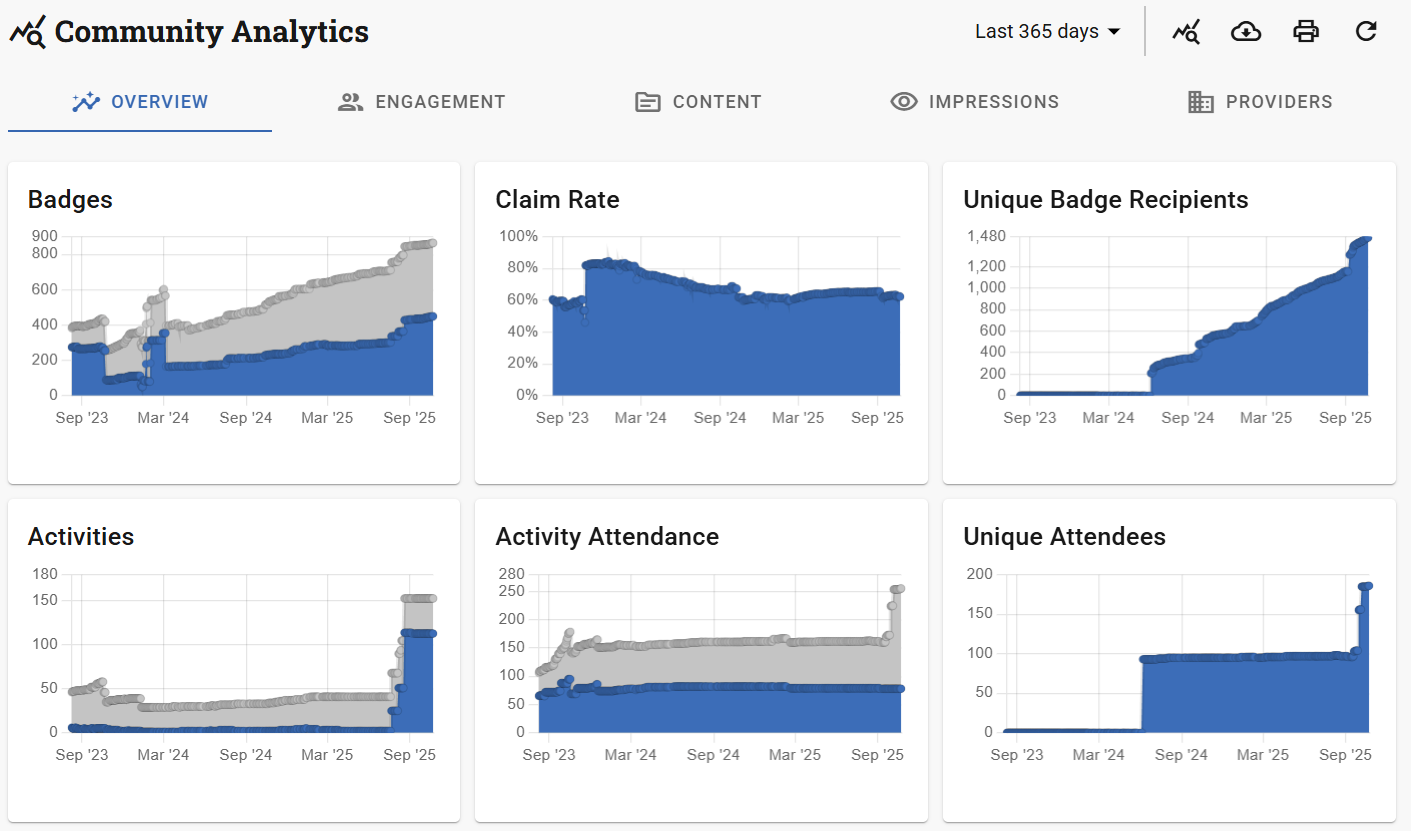
A high-level summary of how your organisation’s content is performing over time.
You’ll find:
Graphs showing the number of badges, activities, and pathways created over time.
Badge claim rate trends, helping you understand how many issued badges are actually being accepted.
A breakdown of unique recipients for each type of entity (badges, activities, pathways), helping you track reach and growth.
2. Engagement tab
Focused on understanding who is engaging with your content and how.
Split into multiple views:
Badges Issued
Activities Attended
Pathways Started
Community Members (Only available for communities)
Each view provides insights into user characteristics such as:
Issuing Method (for badges. How many of your badges were issued by email, in bulk, via activities etc.)
Location (e.g. country, region or city)
Interests (based on tagged topics or skills)
Learning styles
Career Aspirations (e.g. employment status, job title,desired outcome)
This data is ideal for tailoring content to your audience and ensuring inclusion.
3. Content tab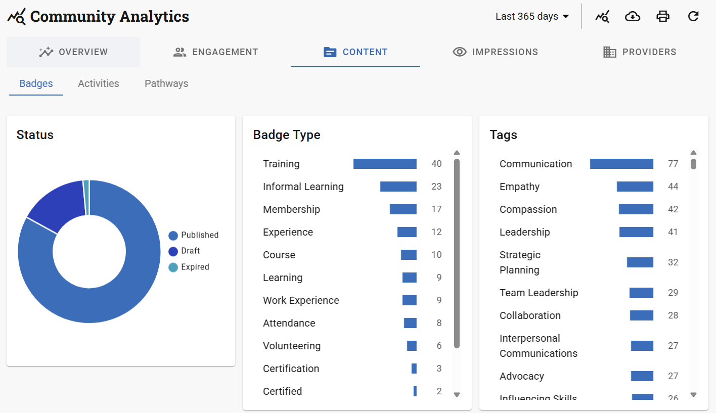
Helps you assess the scope and structure of your content library.
Separated into:
Badges
Activities
Pathways
Each section provides:
A count of entities by status (Published, Draft, Expired etc.)
A count of entities by type
Tag usage and popularity
Badges that are used on activities and pathways
And more...
This is especially useful for checking coverage, spotting gaps, and evaluating the workload required by different badges or pathways.
4. Impressions tab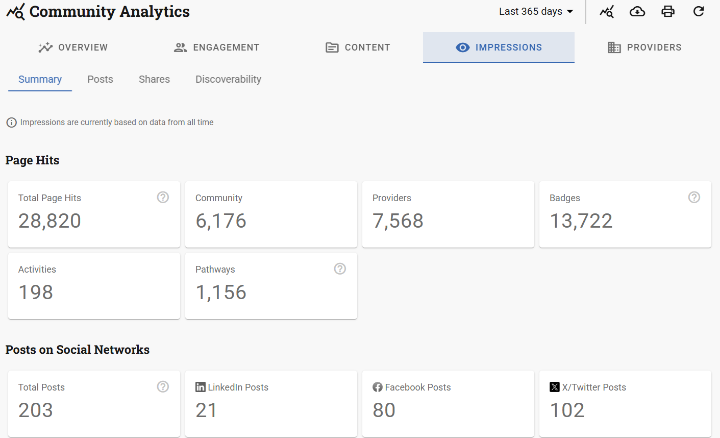
Shows how users are finding and sharing your content.
Divided into four areas:
Summary – Top-level engagement data.
Posts – Performance of public activity, pathway, or badge posts.
Shares – What content is being shared and on which platforms (e.g. LinkedIn).
Discoverability – Data from the Navigatr Discover page, showing how visible and engaging your content is in search results.
5. Providers tab (Only available for communities)
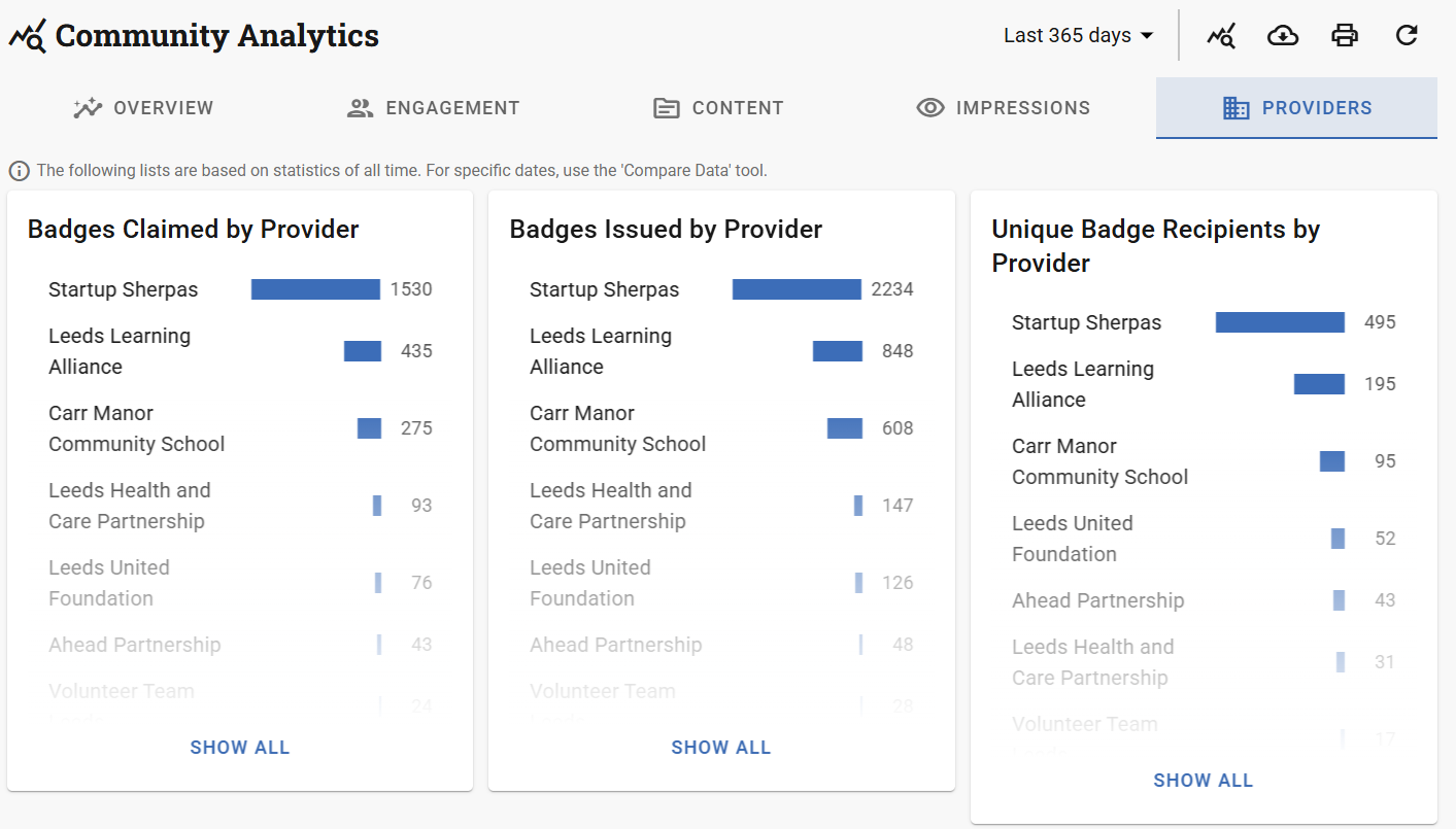
Demonstrates how each provider within your community is performing on various criteria such as:
- Badges claimed, issued and unique recipients
- Unique pathway and activity participants
- Top level information about your communities such their location, type, and rating
6. Additional functionality
In addition to the main tabs, the dashboard includes several powerful tools:
Filter by Date
Every tab supports date filtering, including custom date ranges, making it easy to track performance across months, terms, or reporting periods.
Compare Data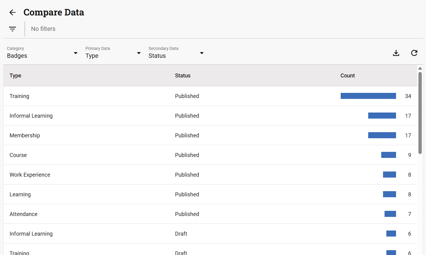
The Compare Data tool allows you to generate flexible comparison tables across badges, activities, pathways, and user engagement. You can compare entities using up to two data points (e.g. status and type, or cost and tag), apply filters (e.g. by badge or creation date), and download the table as a CSV for reporting. This tool is especially helpful for spotting trends, gaps, or standout performers in your offer.
Export to CSV
Data from all main areas — including:
Badges
Activities
Pathways
Assertions (i.e. earned badges, attended activities, completed pathways)
Community Members (Only available for communities)
Provider-level stats (Only available for communities)
…can be exported to CSV files for further analysis or reporting.
Print Views
Every page of the dashboard can be printed directly, making it simple to share insights with stakeholders.
Was this article helpful?
That’s Great!
Thank you for your feedback
Sorry! We couldn't be helpful
Thank you for your feedback
Feedback sent
We appreciate your effort and will try to fix the article